
ZaryaMedia
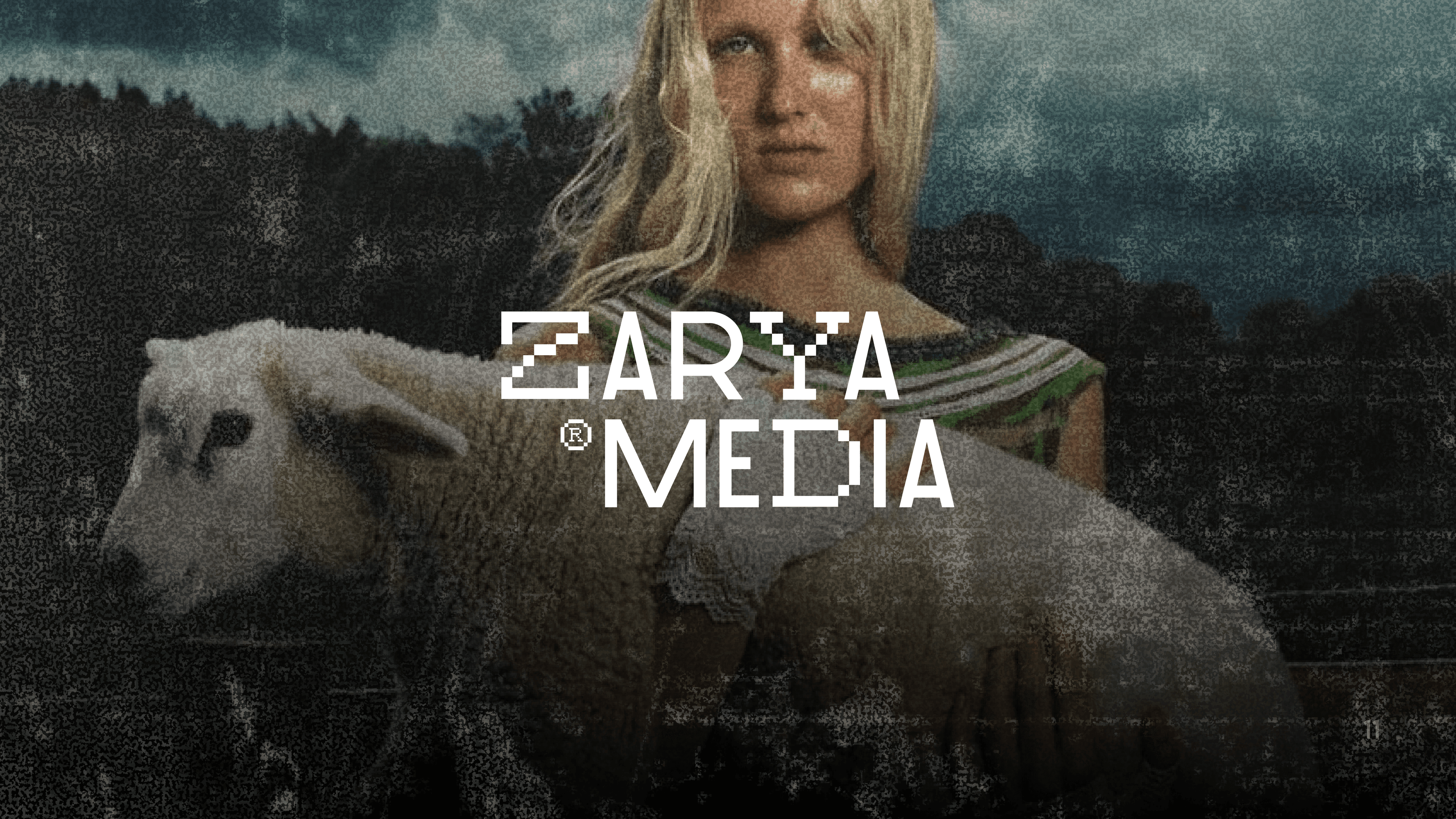
the problem
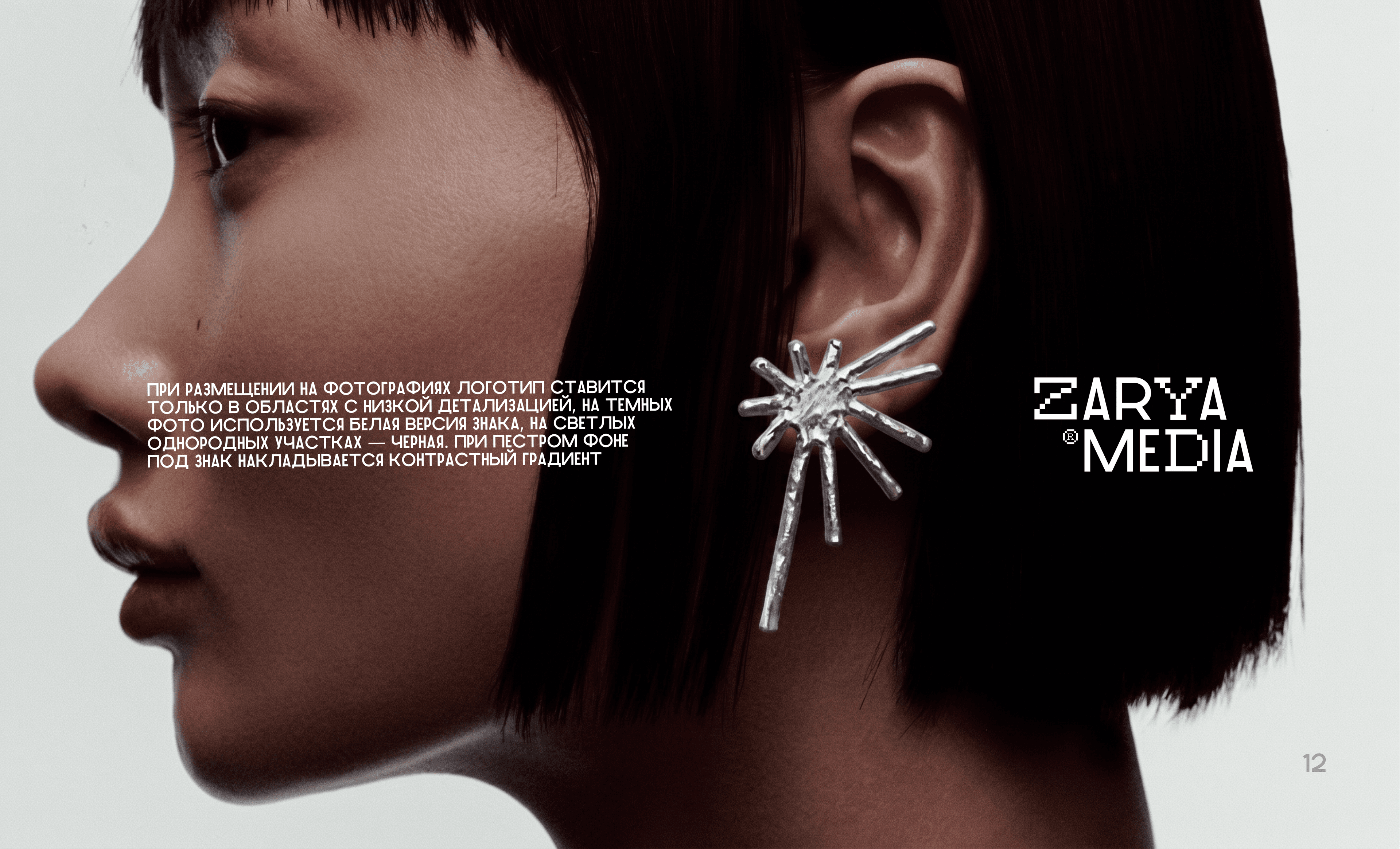
Develop a bold, trendy, and strict brand book that will set ZARYA MEDIA apart from conservative B2B advertising operators. It was necessary to move away from the boring corporate style towards a fashionable digital avant‑garde (digital/fashion/brutalism), while still maintaining technological sophistication, perfect readability on digital media, and clear rules for adapting the identity.
the solution
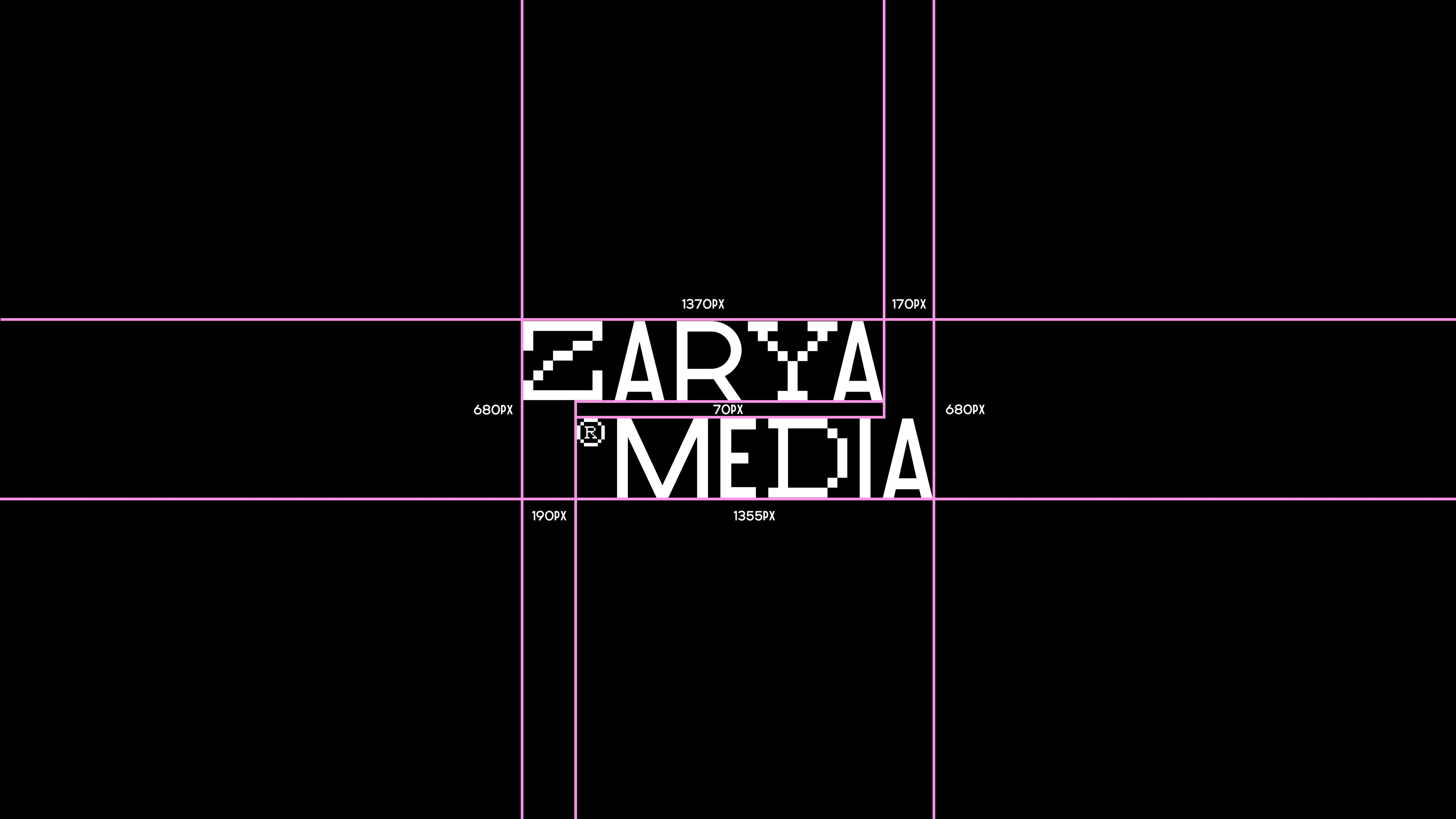
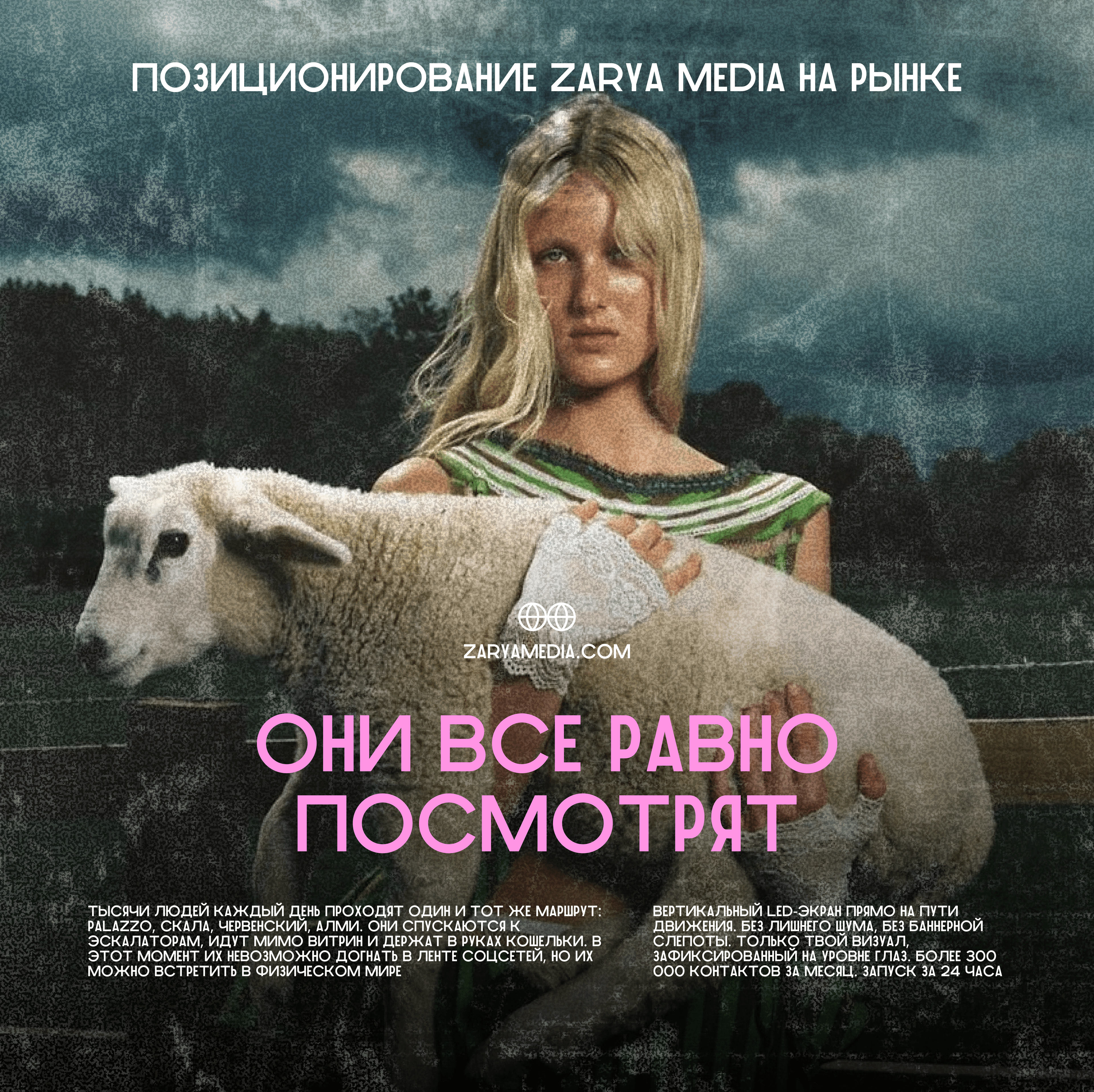
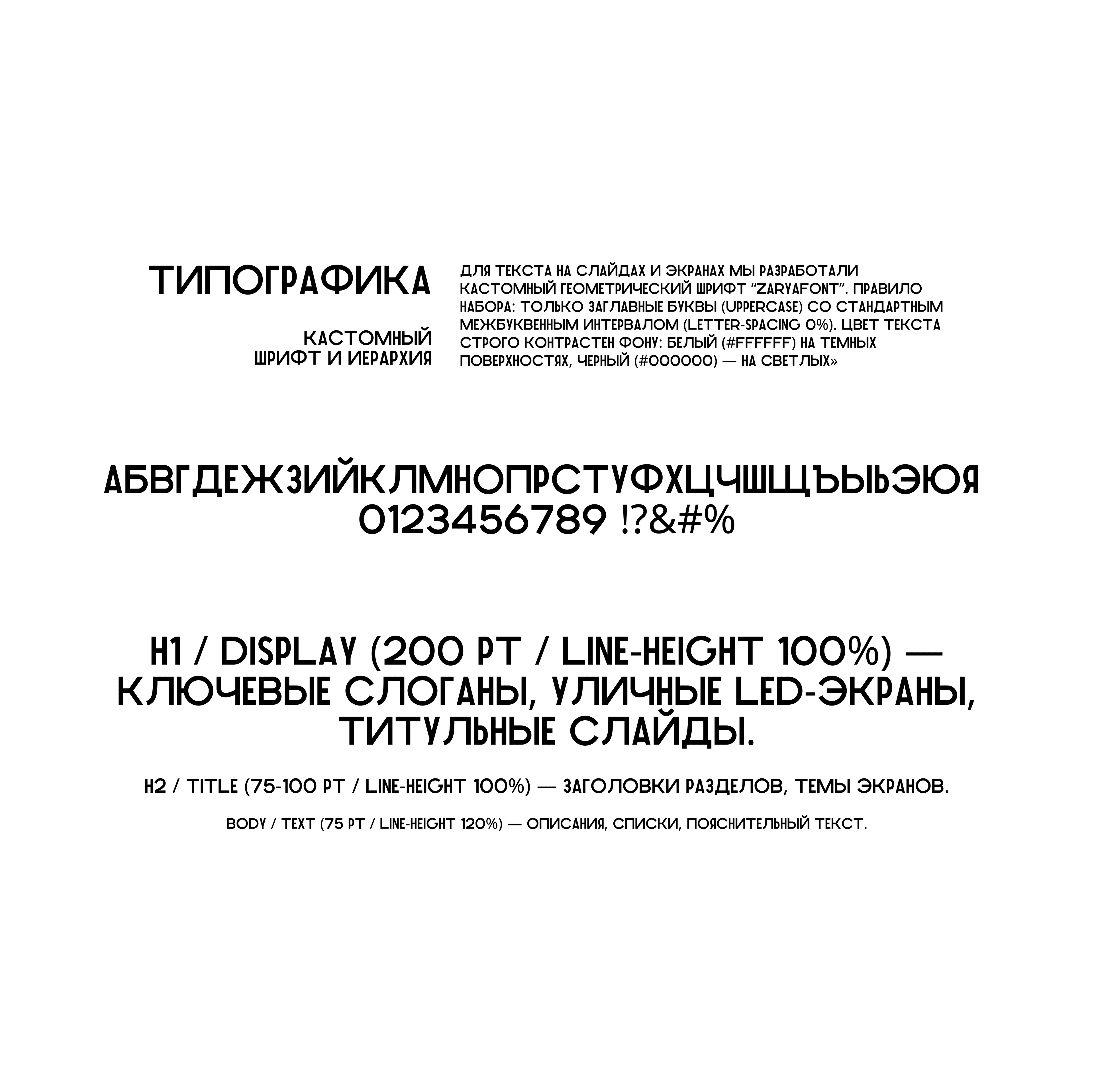
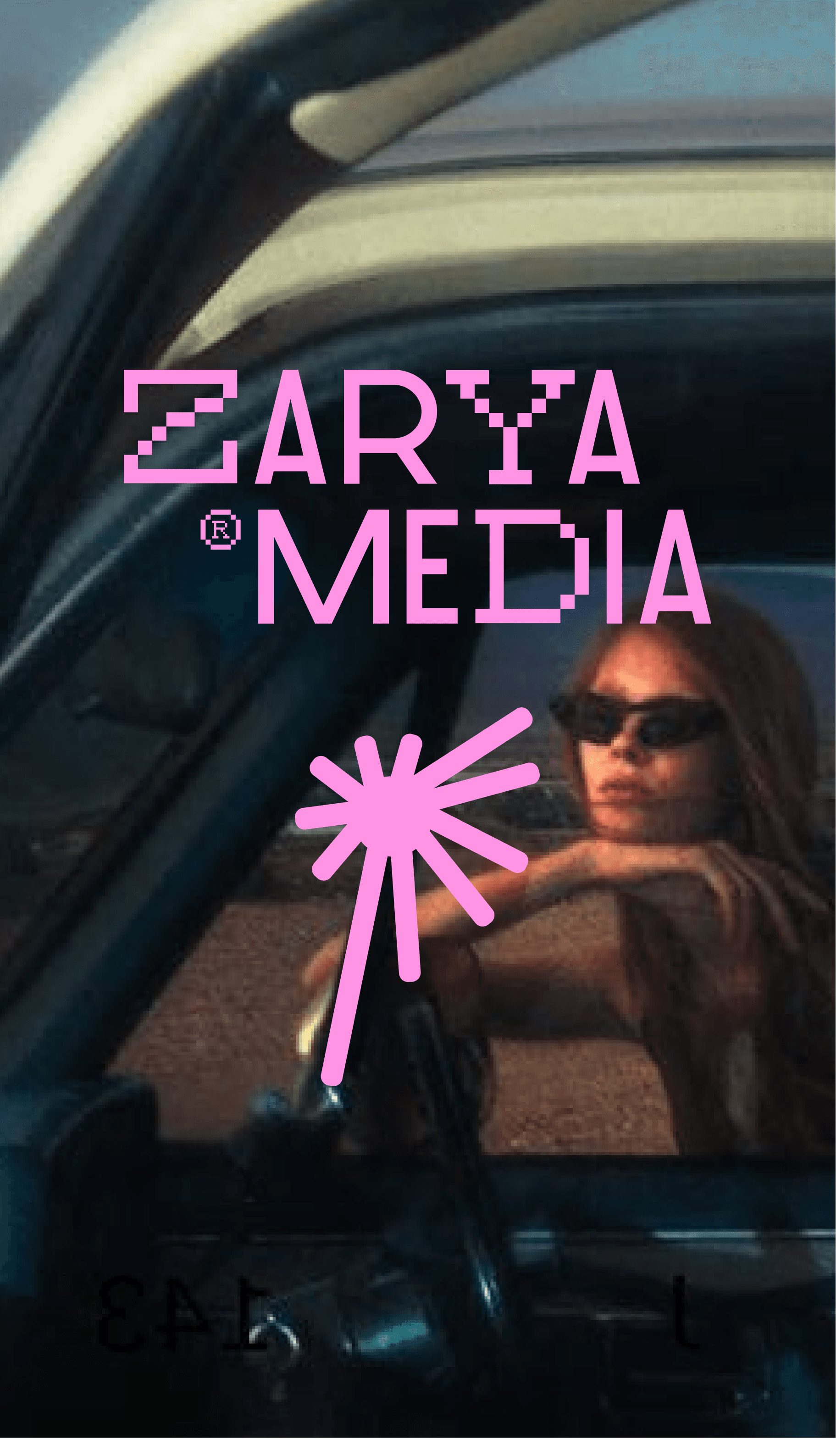
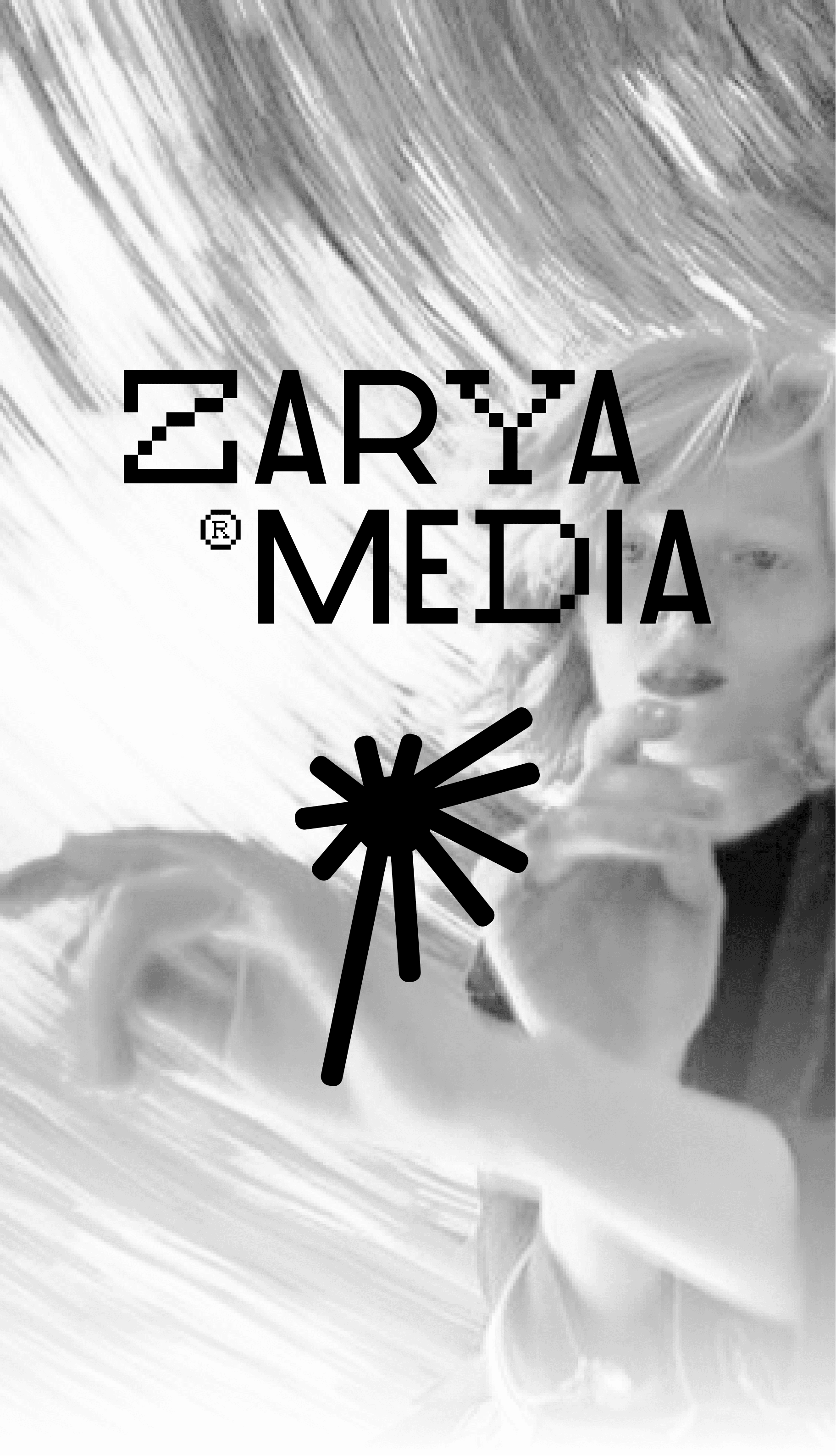
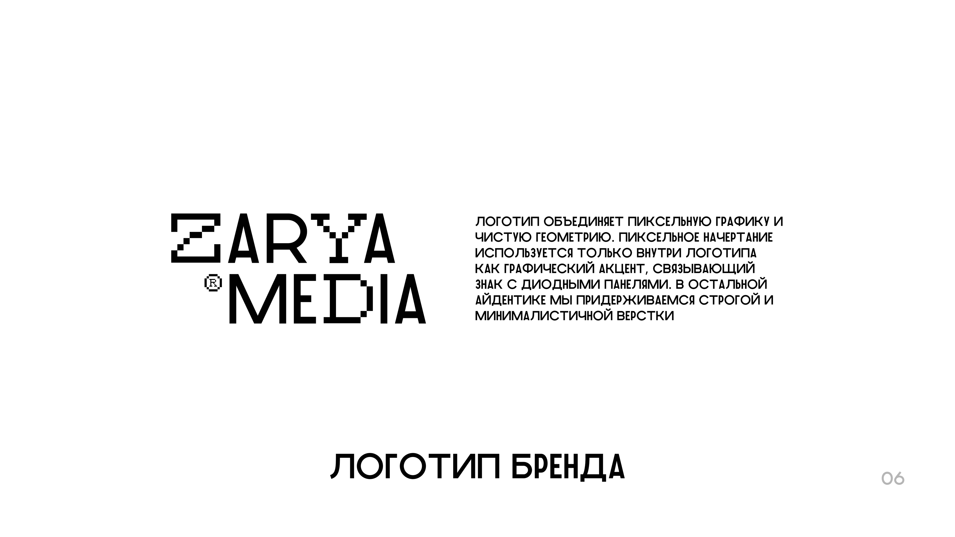
Based on the insight “They’ll still look anyway,” we combined digital pixel aesthetics with fashion art: we built the logo using a strict modular grid, designed a custom display typeface called “ZARYAFONT,” and established strict rules for contrast and layout tailored to vertical LED screens and digital formats.
results
The client has moved away from the image of a typical B2B advertiser, gaining the status of a bold, next‑generation media outlet and a ready‑made design system that attracts premium advertisers, eliminates visual clutter, and significantly speeds up the preparation of any commercial materials.
other works
 01
01staktusa.ru
staktusa — web development
 02
02vnskwear.com
vnsk wear — web development
 03
03велсора.рф
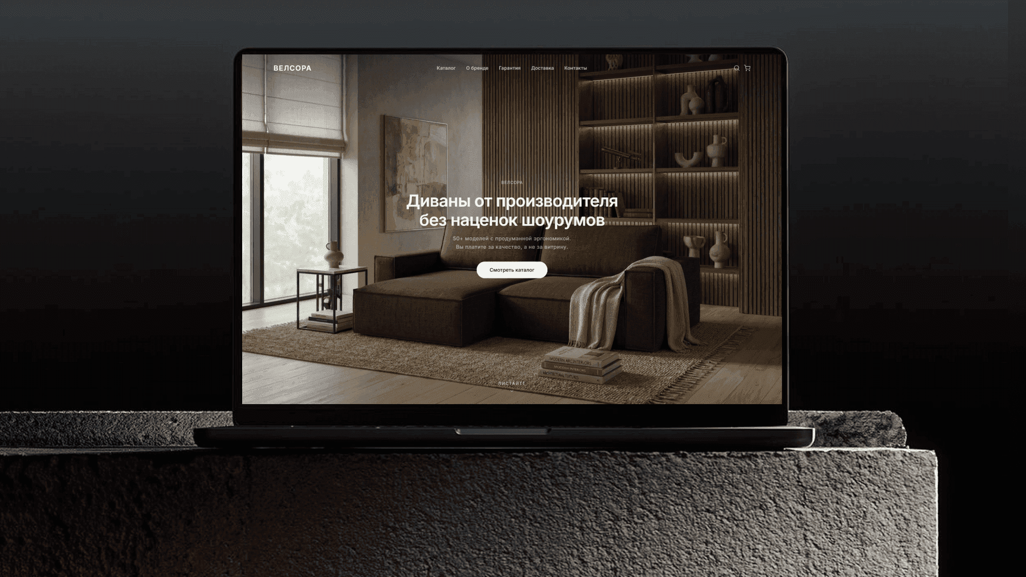
velsora — web development
 04
04tamsiam.ru
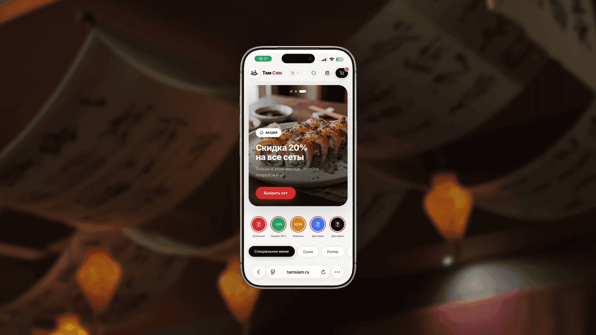
tamsiam — web development
 05
05Wild luxury
Дикий люкс — web development
 06
06mestobe.ru
Место быть — web development
 01
01Ru prom
Ru prom — logo design
 09
09RusGuard App
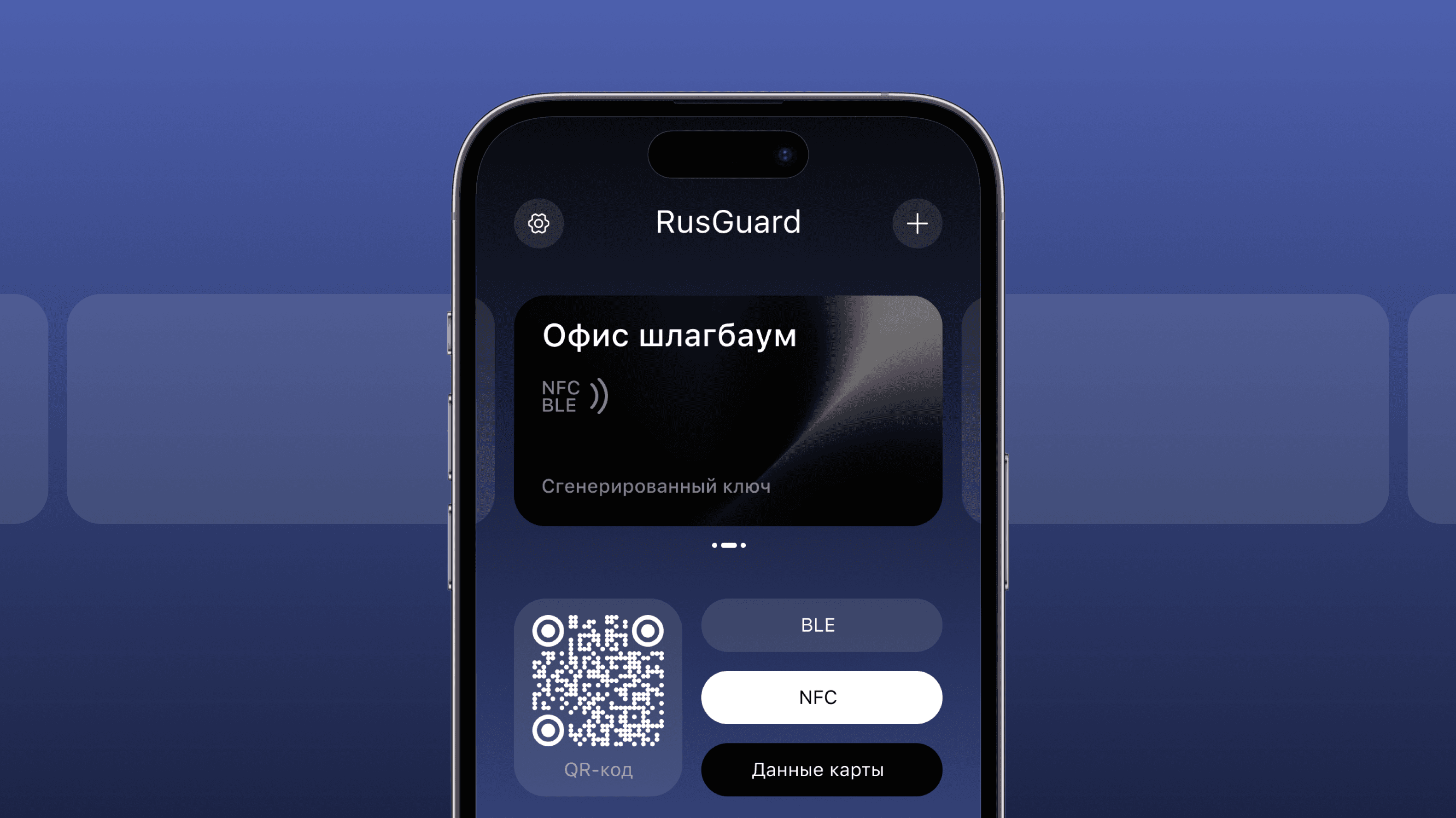
RusGurdKey — mobile app