Wild luxury
the problem
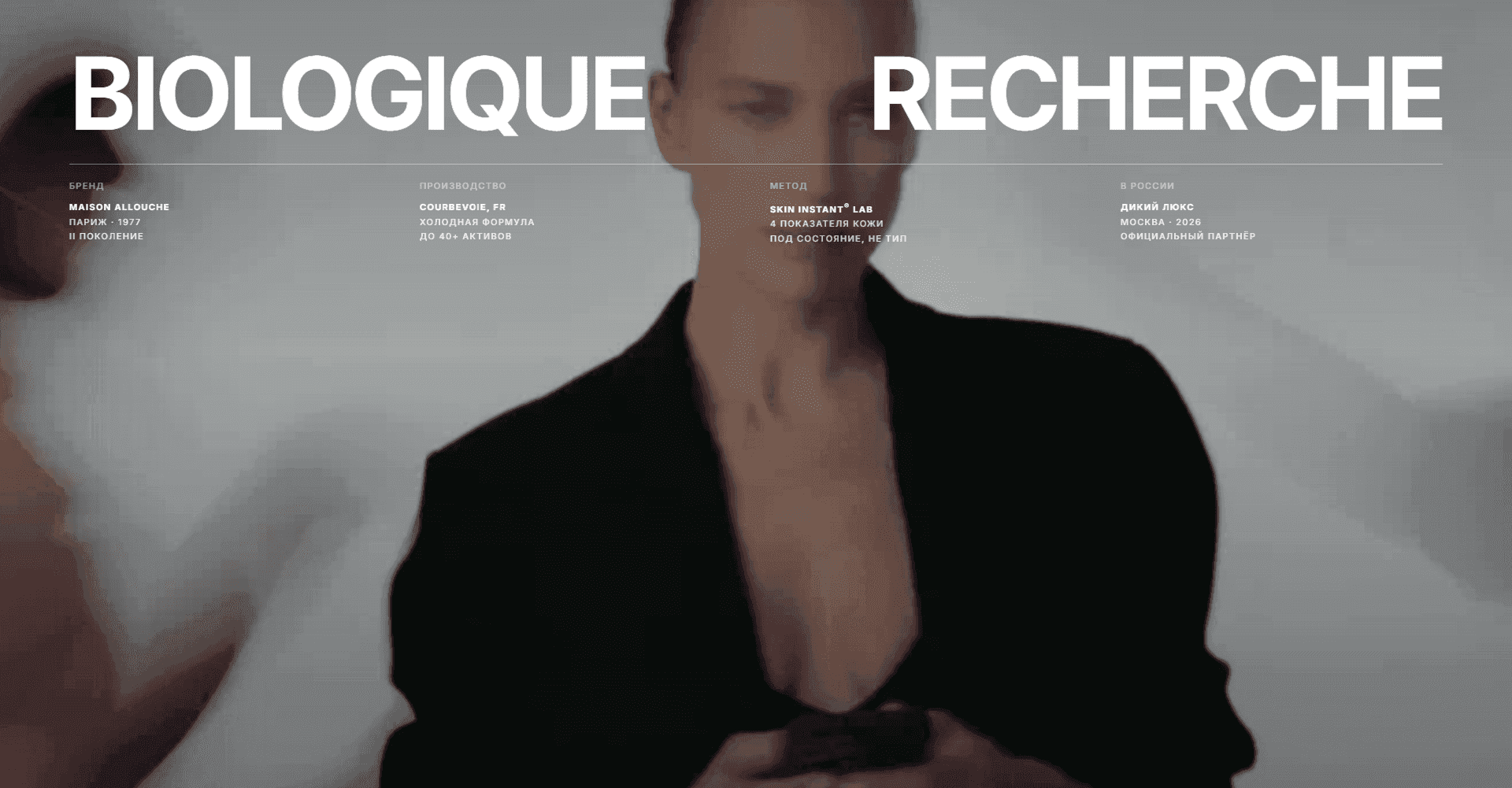
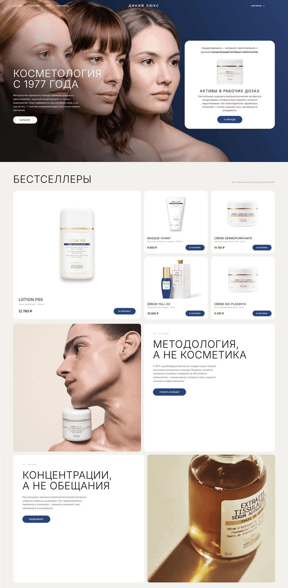
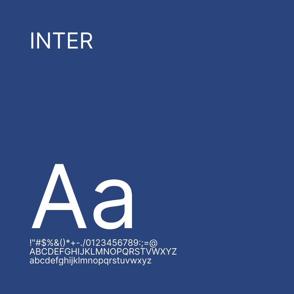
Мы выбрали концепцию "Тихой роскоши": благородная пастельно-кремовая палитра (#F2F1ED), чистый белый цвет карточек, темно-синий акцент (#29457C) для кнопок целевых действий и премиальная типография accidental, основанная на шрифте Inter. 1. Разработка UX/UI и структуры (Bento Grid) Первый экран (раздел Hero): Мы создали атмосферный полноэкранный блок с вращающейся визуальной частью и лаконичным предложением. Они добавили быструю навигацию по разделам и выделенную кнопку для перехода к бестселлерам. Каталог в формате Bento Grid: Отказались от скучной таблицы продуктов. Мы создали асимметричную сетку с одной большой акцентной карточкой (флагман продукта) и сеткой компактных карточек. Это удерживает фокус внимания и задает ритм при просмотре. Основное внимание уделяется тактильному ощущению товаров: мы настроили эффекты увеличения (масштабирования) и плавного "парения" флагманских баночек с косметикой при наведении курсора, создавая ощущение присутствия в офлайн-бутике. 2. Интерактивная механика и рассказывание историй. Стопка карточек для укладки на липучке: Мы разработали нестандартный блок с плавной фиксацией карточек при прокрутке. При прокрутке разделы накладываются друг на друга — этот прием удерживает внимание пользователя во время изучения философии бренда и особенностей ухода Biologique Recherche. Информативная карточка товара: категории, название, объем, ноты аромата/текстуры и понятная цена размещены таким образом, чтобы пользователь мог принять решение о покупке за 3 секунды. 3. Техническая реализация и адаптация Адаптивность (в первую очередь для мобильных устройств): Мы разработали отдельную логику отображения для смартфонов. Сложный рабочий стол Bento Grid на мобильных устройствах легко преобразуется в удобную ленту из двух столбцов, сохраняя при этом большие сенсорные зоны для кнопок "Добавить в корзину". Оптимизация производительности: Настроено аппаратное ускорение анимации (will-change, transform), а стандартные системные полосы прокрутки полностью скрыты для создания эффекта нативного мобильного приложения.
the solution
We chose the concept of "Quiet Luxury": a noble pastel-cream palette (#F2F1ED), pure white color of the cards, a deep blue accent (#29457C) for the target action buttons and premium accidental typography based on the Inter font. 1. Development of UX/UI and structure (Bento Grid) The first screen (Hero Section): We created an atmospheric full-screen block with a rotating visual and a concise offer. They brought out a quick navigation through the sections and an accent button to go to the bestsellers. The catalog in the Bento Grid format: Abandoned the boring table of products. We built an asymmetric grid with one large accent card (the flagship of the product) and a grid of compact cards. This keeps the focus of attention and sets the rhythm when watching. The focus is on the tactility of the goods: We have adjusted the effects of magnification (Scale) and smooth "floating" of the flagship jars of cosmetics when hovering, creating a sense of presence in an offline boutique. 2. Interactive mechanics and storytelling Sticky Stacking Cards stack: We have developed a non-standard block with smooth fixation of cards when scrolling. As you scroll, the sections are layered on top of each other — this technique keeps the user's attention while studying the brand's philosophy and the features of Biologique Recherche care. Informative product card: Categories, name, volume, fragrance/texture notes and a clear price have been posted so that the user can make a purchase decision in 3 seconds. 3. Technical implementation and adaptation Adaptability (Mobile-First): We have designed a separate display logic for smartphones. The complex Bento Grid desktop on mobile devices seamlessly rebuilds into a convenient two-column ribbon while maintaining large touch zones for the "Add to Cart" buttons. Performance optimization: Hardware acceleration of animations (will-change, transform) has been configured, and standard system scrollbars have been completely hidden for the effect of a native mobile application.
results
As a result, we released a product that combines the aesthetics of a luxury glossy magazine with the functionality of fast e-commerce. Project results: A unique, image-based website was launched, distinguishing the Wild Lux brand from competitors in the cosmetology niche. The user journey from first landing on the site to adding an item to the cart was reduced to just two clicks. A smooth 60 FPS performance was achieved on all devices thanks to a lightweight layout without heavyweight libraries.