
Ru prom
the problem
RU PROM is a construction company specializing in the implementation of large—scale infrastructure projects, including road construction (which is confirmed by contextual images of pavers and roads). The goal: To create a new visual image that reflects the reliability, scale of operations and technological efficiency of the company. The logo was supposed to favorably distinguish the brand in a competitive market, be associated with progress and moving forward, as well as be scalable and convenient for applying to special equipment, workwear and digital media. Key messages: Reliability and stability (building for the ages). Dynamics and development (moving forward, completing projects on time). Scale and infrastructure (roads, bridges, industrial facilities).
the solution
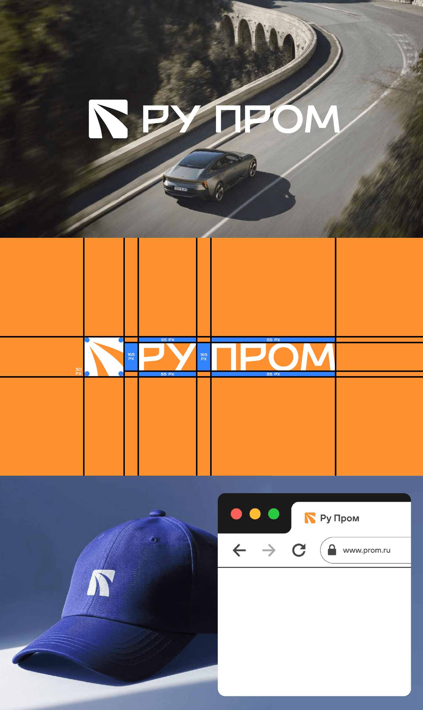
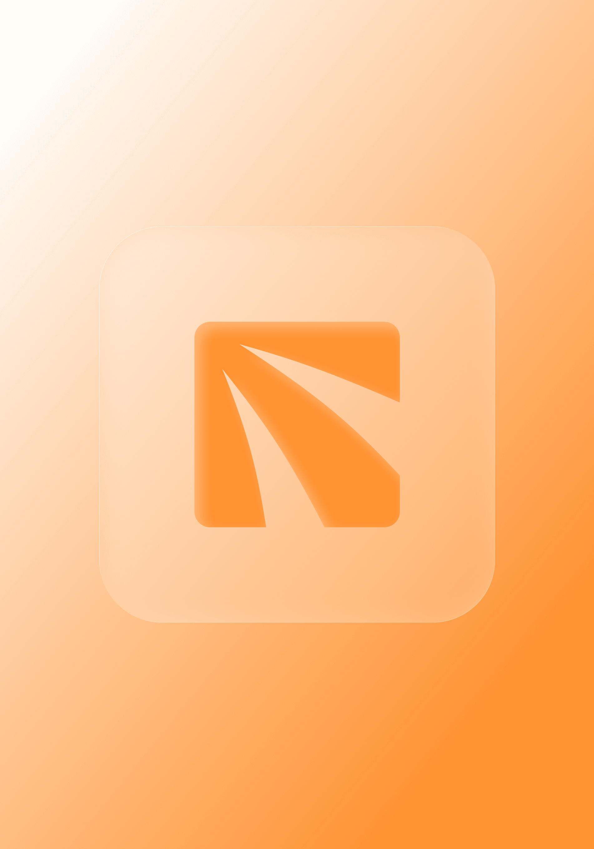
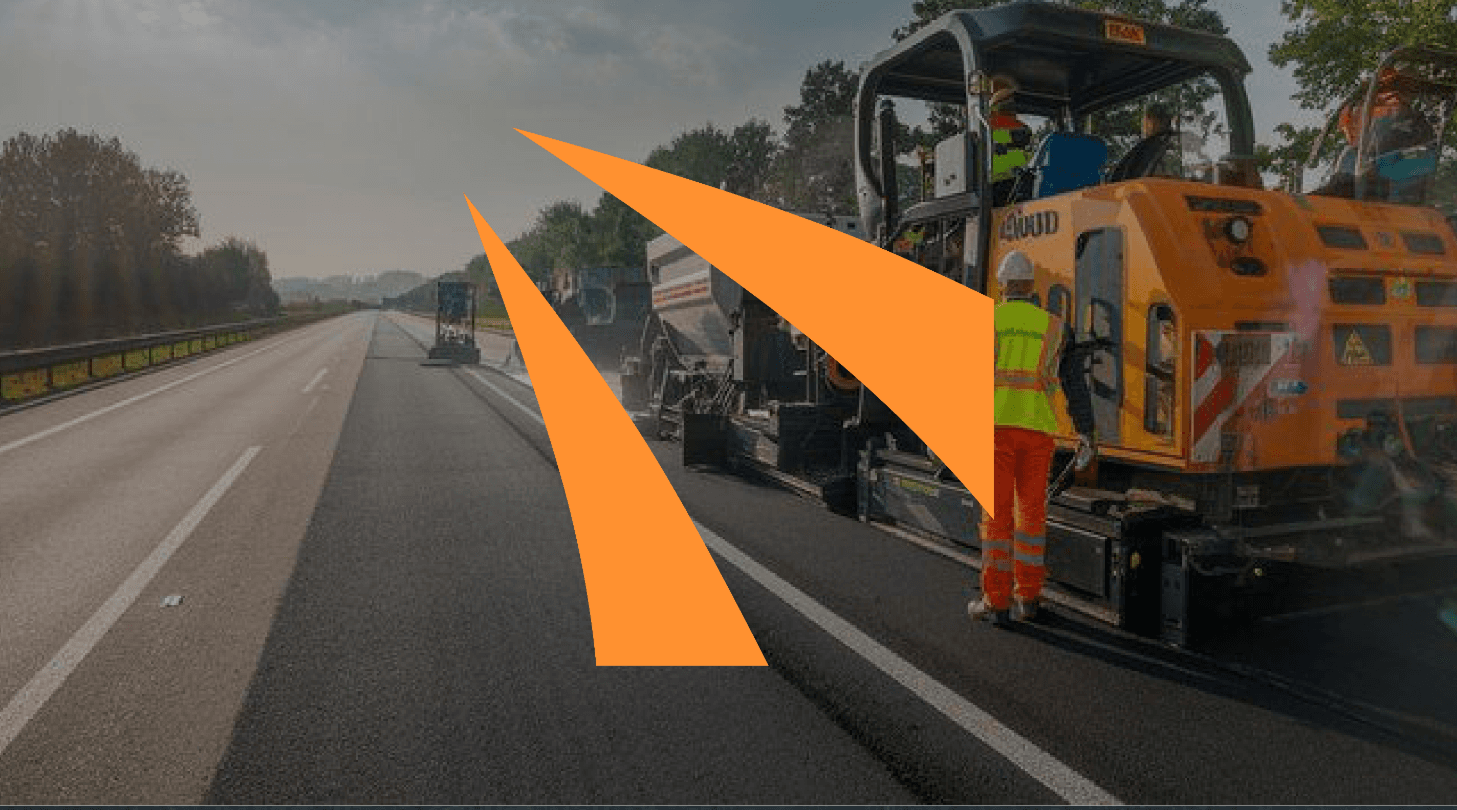
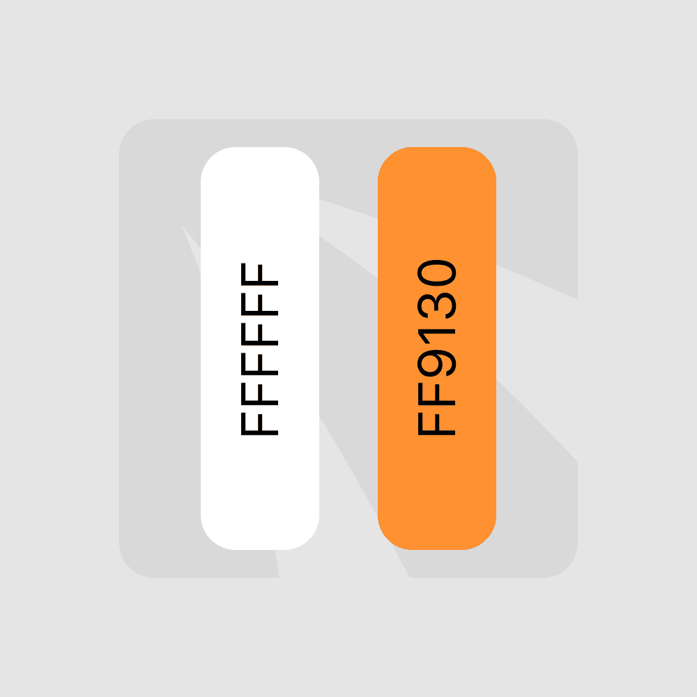
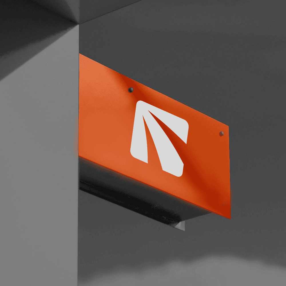
We have abandoned literal and outdated images (helmets, trowels) in favor of an abstract, geometric metaphor combining the ideas of growth and infrastructure. Graphic sign (Icon): The base of the sign is a square (a symbol of stability), inside which is placed a composition of three stripes converging in perspective. This element carries a double metaphor.: Road: This is a direct indication of road construction. The stripes form a perspective of the highway stretching into the horizon, symbolizing the connection of the regions, the scale and completeness of the path (successful completion of the facility). Direction/Arrow: The general outline of the interior composition forms an arrow pointing up and to the right (in a northeasterly direction along the grid). In identity, it is a classic symbol of growth, progress, development and optimism. The company does not just build, it "leads" to the result. The color palette: Bright Orange (FF9130): The main signal color. It is traditionally used in construction to ensure visibility and safety (overalls, road signs). In the logo, he translates energy, activity and a modern approach. White (FFFFFF) and Pure Gray: Used for backgrounds and typography, providing high contrast and purity, which emphasizes processability and precision in work. Typography: A unique font based on geometric grotesque has been developed for the name "RU PROM". The square shapes of the letters echo the shape of the sign, creating a single monolithic block. The hollow, chopped shapes emphasize the industrial character of the company and its solidity.
results
The developed logo represents an integrated and flexible identity system. We have managed to create the image of a modern industrial leader who is not afraid of ambitious tasks. The effectiveness of the solution: Recognizability: The metaphor of the road inside the arrow is easy to read and remember, creating a clear association with the field of activity. Scalability and adaptability: The sign works great in a variety of environments: On special equipment: A bright orange sign on a dark body or asphalt (as in the example of an asphalt paver) ensures maximum brand visibility in the field. On merchandise: A minimalistic badge looks stylish and organic on a cap or overalls (for example, with a blue cap). In numbers: The sign scales perfectly to the size of the favicon (browser tab icon), while remaining legible (example with the browser interface). High technical accuracy: A detailed modular grid guarantees the accuracy of the reproduction of the logo on any media, from a business card to a banner on the facade of the building. The final image of RU PROM is a company that builds roads into the future, guaranteeing quality and meeting deadlines.
other works
 01
01staktusa.ru
staktusa — web development
 02
02vnskwear.com
vnsk wear — web development
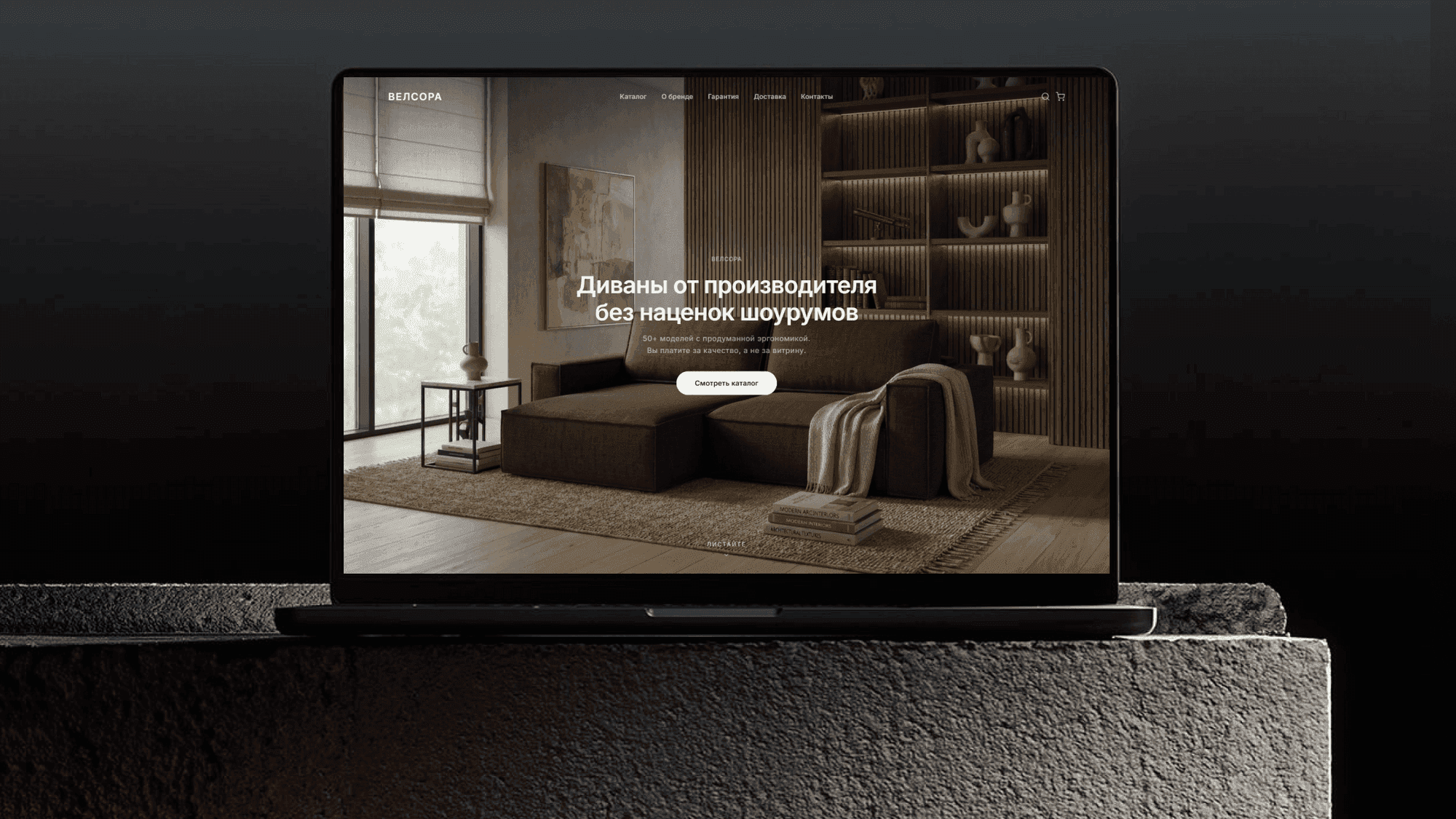 03
03велсора.рф
velsora — web development
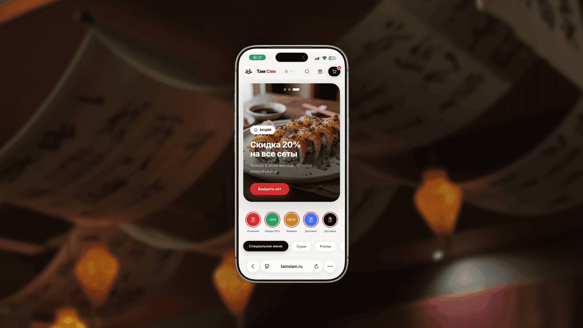 04
04tamsiam.ru
tamsiam — web development
 05
05Wild luxury
Дикий люкс — web development
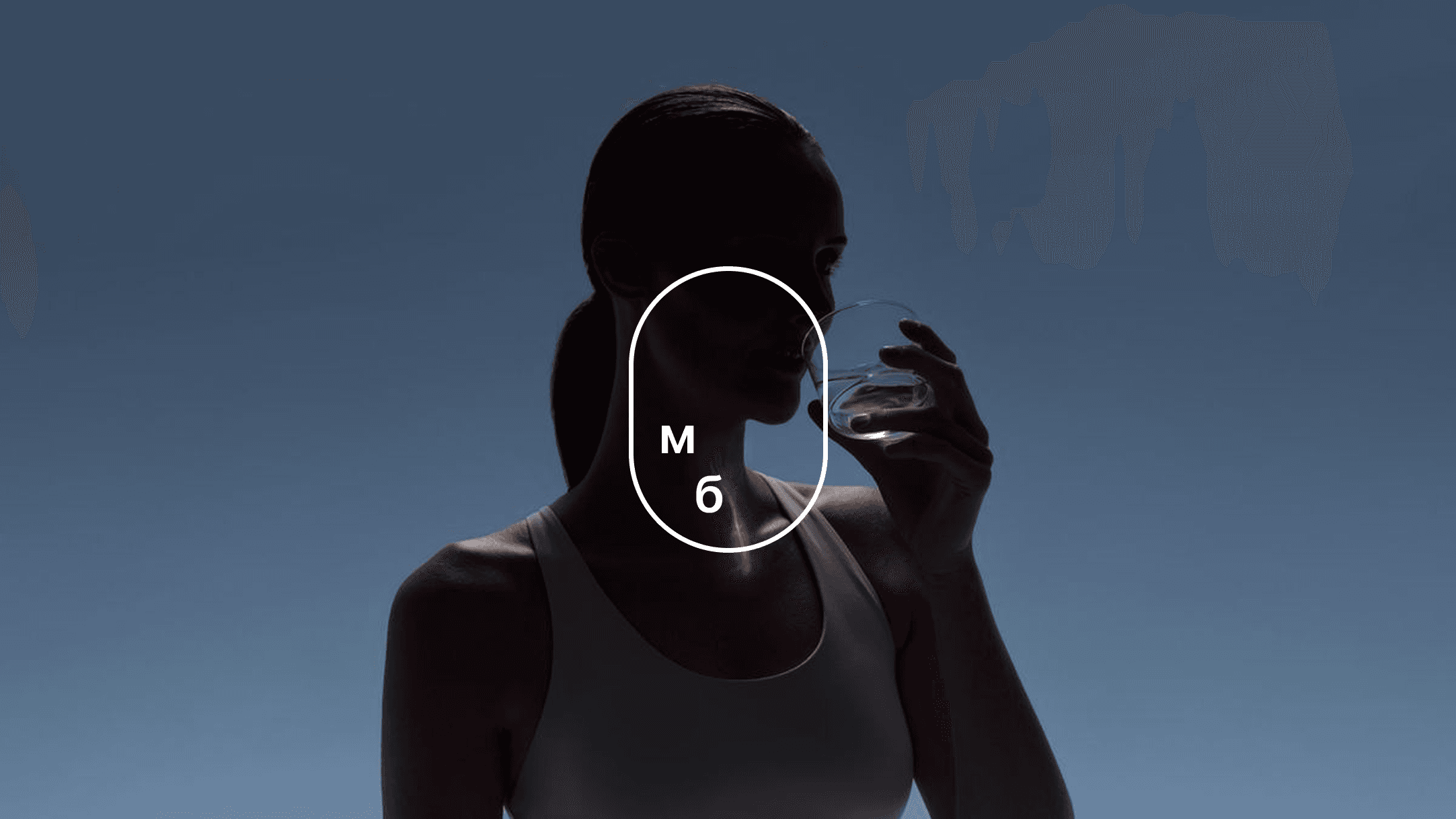 06
06mestobe.ru
Место быть — web development
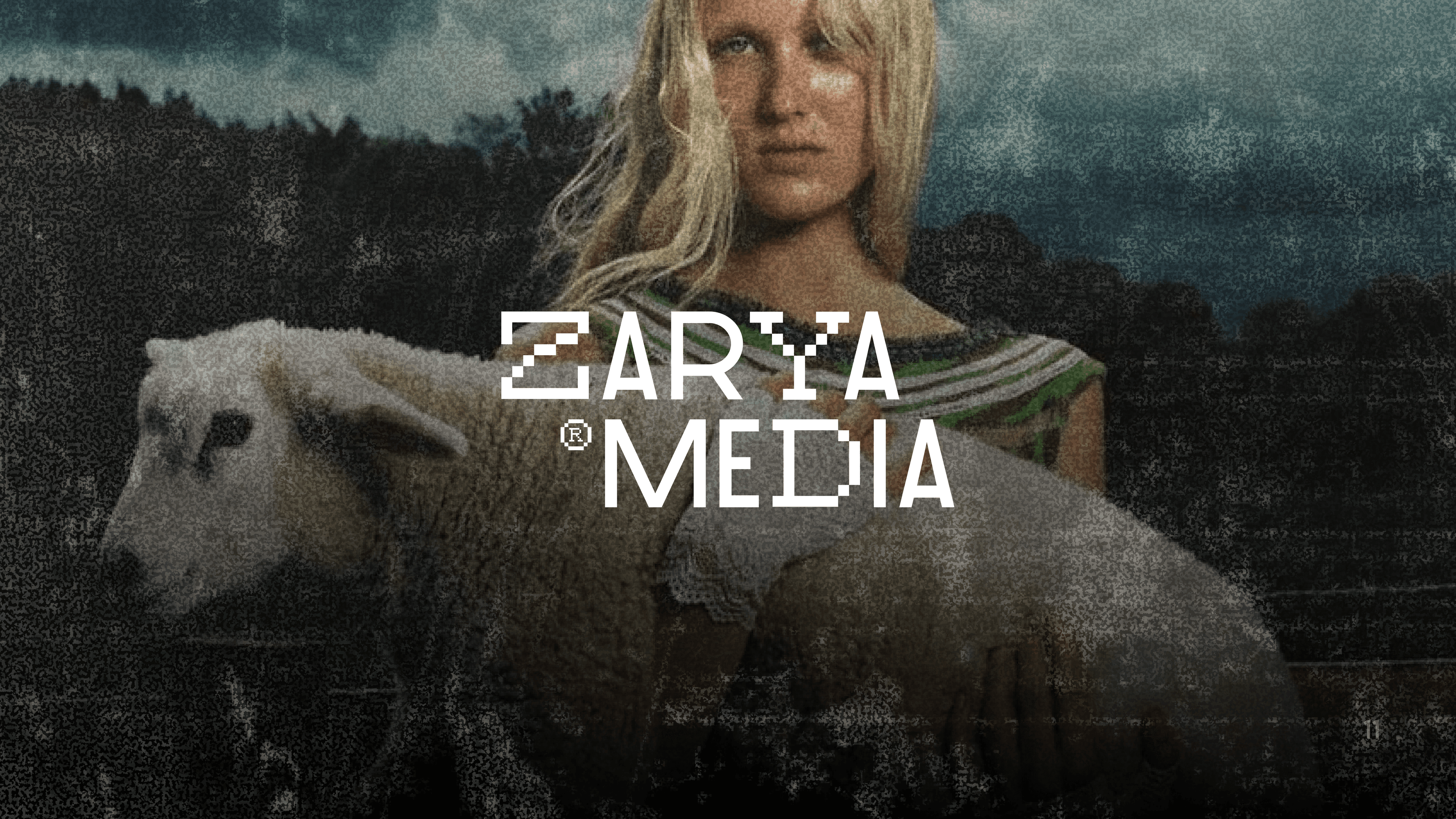 08
08ZaryaMedia
ZaryaMedia — logo design
 09
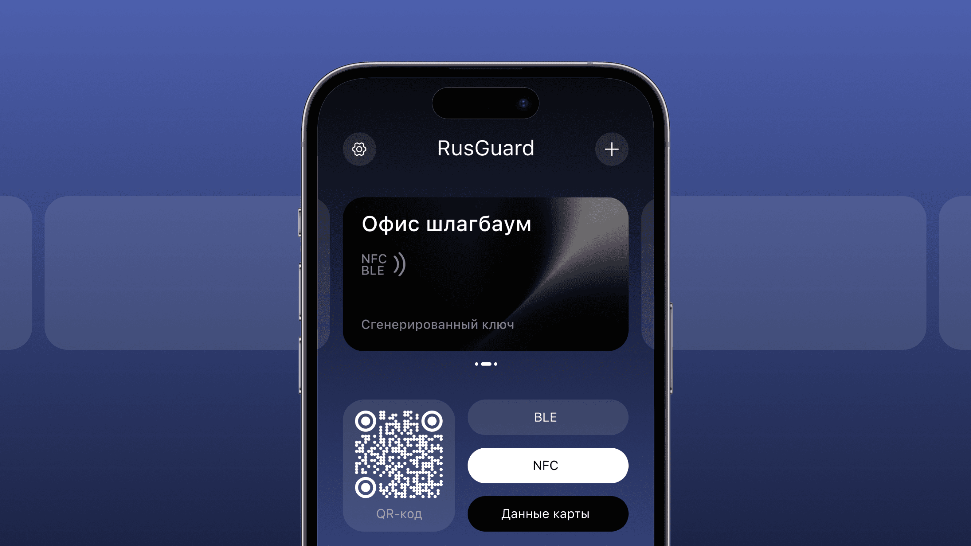
09RusGuard App
RusGurdKey — mobile app